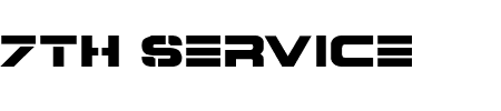
When we created our title sequence we wanted to represent the type of film that we produced, however after through all of the fonts on livetype we could not find a style that fitted with the whole 'business' theme, so we went onto a website called 1001fonts.com and looked at a variety of fonts. After we found a font that suited our thriller we downloaded it, it was called '7th Service'. Personally i thought that this font was effective because it has a action thriller stylistic feel too it with the straight lines and the abolishment of traditional serif typography, we wanted our thriller to be unique and i believe that because we chose a font that is completely different to something that you would usually see in a thriller, we achieved our goal.
We chose to have the title of our movie 'Nameless' on a black screen (similar to a thriller movie called Mesrine) we chose to do this because it makes the audience anxious. The rest of our titles appear over the top of our narrative opening, with all of that said i think our titles are successful.
No comments:
Post a Comment